
Sapori - Experience the Culinary Soul of Italy
Brand Identity | Restaurant Branding | Packaging Design | Hospitality Design
A premium Italian Restaurant | Café rooted in tradition, refined for today’s generation. Inspired by Tuscan landscapes, Nonna’s recipes, and a love for timeless flavour.
Brand Story
Sapori is an Italian restaurant that celebrates the soulful, sun-drenched flavours of Tuscany. It was born from the desire to bring timeless, heartwarming recipes — like those from Nonna’s kitchen — into the contemporary dining scene of London. Sapori is not just a place to eat, but a place to feel.
The Challenge
In a saturated food scene, Sapori needed to stand out as more than “just another Italian place.” They wanted to express their story — rooted in tradition, but appealing to a new generation of diners. Millennials and Gen Z, especially, are drawn to authentic experiences and shareable aesthetics. Sapori had to feel sincere, soulful, and modern — all at once.
The Solution — Strategy & Visual Identity
I built the brand identity around a poetic visual narrative. The logo uses a rising sun, winding path, and a soft arch window — evoking the rolling hills of Tuscany, fresh ingredients, and the warmth of a rustic home. The wordmark is a fusion of elegance and geometry, appealing to the modern eye while nodding to heritage.
We chose a muted, earthy colour palette to reflect the natural, sun-seasoned ingredients. The visual system was crafted to express simplicity with soul — inviting, elegant, and distinctly Mediterranean.
Branded Assets
Logo Design: Rooted in tradition, designed for presence.
The Sapori logo is a poetic visual story — where every element is intentional.
At its heart, the symbol captures a rising sun above a winding Tuscan path, framed inside a soft-arched window. It’s a quiet nod to warm Italian mornings, slow moments, and the connection between land and flavour. The form evokes both home and horizon — grounding Sapori in comfort, heritage, and optimism.
The custom word mark complements this story with a refined geometry, echoing Italian shop signage and classic serif elegance. The balanced proportions and sculpted strokes give the brand a confident yet approachable tone — distinctly Italian, unmistakably modern.
The logo system is designed for flexibility across mediums — from signage to packaging. The rising sun icon, elegant word mark, and modular lockups work together to express warmth, heritage, and modernity across all brand touch points.


The Sapori logotype is custom-drawn, inspired by vintage Italian storefronts, early 20th-century geometry, and the sunlit curves of Tuscan architecture. Its softly arched forms and subtle stroke contrasts bring a sense of heritage, while still feeling crisp and contemporary — like the restaurant itself.
To balance the crafted wordmark, we chose Merriweather Sans Medium as the primary supporting typeface. Clean, approachable, and legible across print and digital formats, it keeps the communication grounded while allowing the brand to speak clearly — whether on menus, packaging, or web.
Typography & Wordmark:

Colour System:
The Sapori palette draws inspiration from Italy’s timeless terrain — colours you’d find walking through a Tuscan village at golden hour. These aren’t just tones; they are ingredients of emotion. From the terracotta of sun-warmed rooftops to the dusty green of olive groves, every hue whispers of slow living, comfort, and flavour.
We crafted this sunbaked system to reflect Sapori’s core values: warmth, authenticity, and soul. Whether printed on textured paper or seen across digital screens, the colours feel grounded and memorable — made to linger, just like a perfect meal.
Marketing Collateral:
From posters to thank-you cards — every piece was designed to be story-driven, print-ready, and visually aligned with Sapori’s soulful brand world.


Packaging mockups:
Includes coffee bags, takeout containers, pizza boxes, and eco-friendly carry totes — all designed to be shelf and photo-ready.


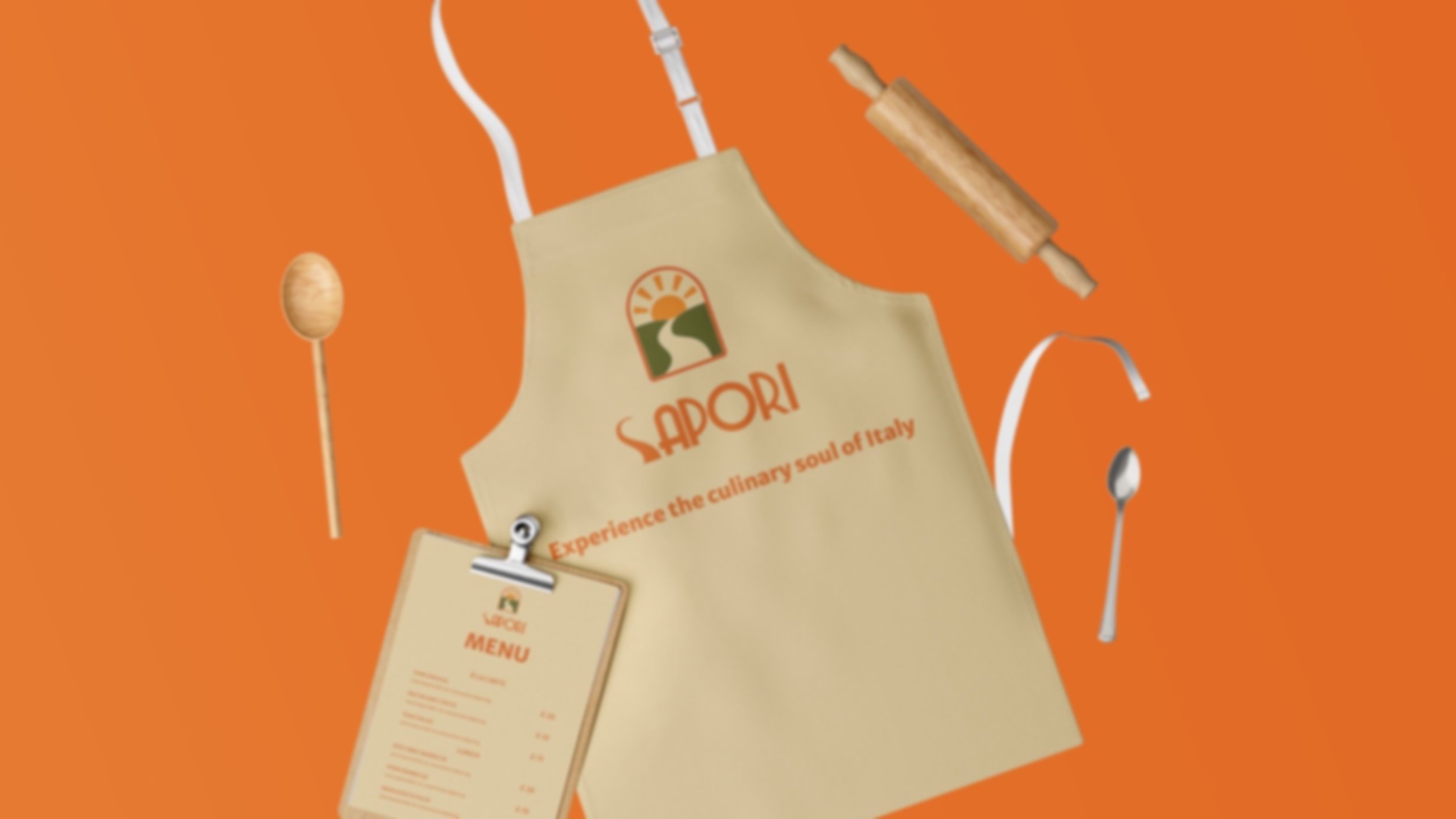
In-Store Experience:
Menu design, bar visuals, cups, cutlery sleeves, and a full visual interior narrative.


Digital Experience:
Social media mockup and a scroll-friendly website interface — designed with micro-interactions, warm tones, and storytelling emphasis.

Stationery:
Branded touchpoints like cards and envelopes that carry the soul of Sapori with every interaction.

Uniform System:
Designed to feel timeless, work-ready, and camera-friendly.


Bringing Soul to the Table
Sapori isn’t just a restaurant or café — it’s a story of soulful simplicity, inspired by Tuscany’s sun-drenched charm. Rooted in tradition and designed for today’s diners, this hospitality brand identity brings together modern design with timeless flavour.
From the rising sun in the logo to an earthy, tactile palette — from coffee bags and pizza boxes to a cozy café interior — every detail was crafted to evoke warmth, heritage, and connection.
This full-spectrum branding project spans logo design, visual identity, packaging, and interior styling — blending emotion and strategy to make Sapori unforgettable.
Launching a food, beverage, or hospitality brand that needs more than good visuals — something that speaks, lives, and connects — let’s build it together.
Looking to bring your food vision to life? I help brands go beyond decoration, into lasting identity.
Let’s Connect
I’m excited to hear about your project and how we can work together to build a brand that truly stands out.
Whether you’re ready to start now or just have a few questions, feel free to reach out. I’m here to help.