(Socials)
© 2026 Mayank Gambhir All Rights Reserved

© 2026 Mayank Gambhir All Rights Reserved
(Socials)
© 2025 Mayank Gambhir All Rights Reserved

THE PETITE STANDARD
Designed for. Not Adjusted For.
A premium womenswear brand built around a simple idea: petite women deserve clothing designed for their proportions, not altered to fit them.
Founded by Elizabeth and Denise, The Petite Standard began with a better approach to the everyday trouser: considered fit, timeless design, and a more thoughtful experience.
SERVICES: | BRAND IDENTITY · PACKAGING · WEBSITE UI/UX · SOCIAL MEDIA DESIGN |
INDUSTRY: | FASHION/WOMENSWEAR |
YEAR: | 2026 |


Understanding
the problem
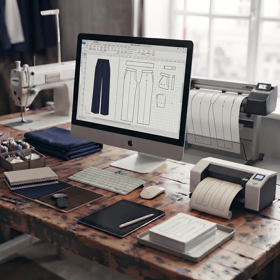
At 4'11" and 5'2", Elizabeth and Denise knew the problem first-hand. Petite clothing usually starts with standard sizing and removes length, which leaves the rise too low, the break pooling at the ankle, and the proportions subtly wrong even after a tailor has been paid.
Their first product was a dress trouser built outward from a 26.5 inch inseam rather than cut down to reach it, priced at $295. The identity had to carry that price without turning cold, in a category where this customer has been let down before.
Finding the mark
The alate came from Elizabeth and Denise. It is the winged form of an ant, the one that leaves the colony to found a new one, and it carried the idea they cared about most: she is the smallest thing in the system, and the whole system exists to support her.
The brief held two things that do not obviously belong together. An insect, and their Filipino heritage, which they wanted carried quietly rather than worn as a theme. Drawn literally it becomes an insect on a trouser label. Drawn as ornament, the heritage turns into decoration.
Calligraphy solved both. The silhouette is a single sweeping stroke taking its cue from Baybayin, the pre-colonial Philippine script, so the heritage sits in how the mark is made rather than in anything applied on top of it. The letterforms T, P and S live inside that stroke: T as the crossbar of the wing, P as the loop and stem, S as the curve of the body. You do not see it until it is pointed out, which is the right amount of visible.
By the third round the mark had drifted. The wings were solid and close to symmetrical, and it had started reading as a butterfly, a motif so common in fashion that it is almost impossible to own or trademark. Opening the wings into calligraphic loops and sharpening the asymmetry fixed it. A butterfly is symmetrical. Handwriting is not.

Building
the visual identity
The 26.5 inch inseam is the brand’s whole argument, so it became the measurement the identity is built on. The wordmark’s clear space is derived from it, and the symbol and monograms use the golden ratio directly.
Nobody reading a hang tag will ever know that, and it does not matter that they won’t. It means the spacing is already decided before anyone places the mark, and the system scales from a 5mm embossed symbol to a shopfront without a judgement call.
The palette holds to four colours and the typography to two faces, one reserved for the wordmark and one carrying everything else. For two founders producing their own content, a system they cannot get wrong is worth more than one with range.

Building
the visual identity
The 26.5 inch inseam is the brand’s whole argument, so it became the measurement the identity is built on. The wordmark’s clear space is derived from it, and the symbol and monograms use the golden ratio directly.
Nobody reading a hang tag will ever know that, and it does not matter that they won’t. It means the spacing is already decided before anyone places the mark, and the system scales from a 5mm embossed symbol to a shopfront without a judgement call.
The palette holds to four colours and the typography to two faces, one reserved for the wordmark and one carrying everything else. For two founders producing their own content, a system they cannot get wrong is worth more than one with range.


PATTERNS
The pattern system grew from two parts of the identity. One draws on the wing structure of the alate, translating its veining into a repeating graphic. The other explores the wordmark and its letterforms.
Both are kept deliberately low contrast. They cover the largest surfaces in the system, on tissue and packaging interiors, so they had to stay texture rather than become a focal point.


Bringing
the identity to life
I designed the website and the social templates alongside the core identity, so the brand had a consistent way to show its products and speak online from day one.
Packaging is where a system meets production. The hang tag was signed off and heading to print with gold lettering and a gold barcode on a dark ground. Scanners read contrast rather than colour, and they read in the red part of the spectrum where gold registers as light, so the barcode was inverted. That fails at any size, because the scanner never recognises the start pattern. Keeping the tag intact meant running a full-width corn silk band across the base with the barcode set in black inside it, edge to edge, so it reads as part of the design rather than a patch over a mistake.
The brand guidelines hold the system together, giving Elizabeth and Denise a clear framework for the identity across packaging, website and social.


The Petite Standard was built on a simple belief: petite women deserve clothing designed with them in mind from the beginning.
That thinking shaped more than the visual identity. It carried through the packaging, the digital experience and every touchpoint, giving Elizabeth and Denise a foundation to launch with and grow into.
Designed for. Not adjusted for.


Like what you see? Thinking about working together?
Drop me a line here. I’m always up for a chat - especially with people who are passionate about what they do.
"From the very start of our project together, he was diligent about doing his own research to understand our brand before he drew a single thing. We are building for petite professional women, a customer he has never been, and he did the work to understand her anyway. He asked the right questions, we arrived at a shared understanding of the vision for our brand early, and that understanding carried through everything he made after it.
He held his ground when a change would have weakened the design, and he took our input when we brought him something better. He also worked in sequence, so he was focused on one thing at a time instead of juggling everything at once.
An amazing designer to work with! Highly recommended!"
Denise and Elizabeth
(Founders, The Petite Standard)