(Socials)
© 2026 Mayank Gambhir All Rights Reserved
Sapori explores a warmer, more contemporary direction for Italian hospitality, rooted in the landscape and atmosphere of Tuscany rather than the familiar symbols associated with Italian restaurants.
The aim was to create an identity that feels established and inviting, while giving the brand enough character to carry naturally from the restaurant to the packaging and everything around it.
SERVICES: | BRAND IDENTITY · CUSTOM TYPEFACE · PACKAGING · CAMPAIGN |
INDUSTRY: | HOSPITALITY |
YEAR: | 2025 |
(Socials)
© 2025 Mayank Gambhir All Rights Reserved

THE IDEA
No tomatoes. No pasta. No tricolore.
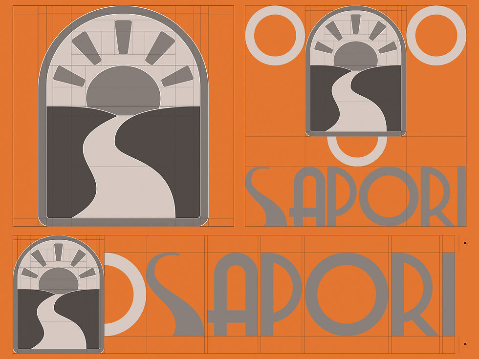
The identity starts with a rising sun over a winding path, framed inside a soft arch. A reference to a Tuscan morning rather than a literal picture of Italian food.
That gave Sapori something more lasting to build from. The landscape could become a colour palette, a pattern and a wider visual language that could carry across the customer experience.
It gave the brand a world to build from, rather than a collection of familiar Italian symbols.
THE IDENTITY
The real test for a restaurant mark is whether it works everywhere the restaurant does.
The mark brings the sun, path and arch together into one form, while the custom wordmark takes cues from early twentieth-century Italian shopfront lettering.
Its softer arches and subtle stroke contrast give the wordmark character without making it feel overly traditional.
Merriweather Sans provides the supporting voice across menus, packaging and digital communication, keeping the system clear where the display type needs to step back.
The palette follows the same thinking. Terracotta, olive and warm sand take their cues from the Tuscan landscape rather than the Italian flag, giving the identity warmth without falling into the expected category palette.
Together, these elements create an identity that can move naturally between the restaurant, the products customers take home and the digital touchpoints they encounter before and after a visit.




THE PATTERN
Recognition without putting the logo everywhere.
The pattern extends the geometry of the identity into a repeatable visual language.
It gives Sapori another layer of recognition across physical touchpoints without relying on a literal repetition of the logo.
That means packaging, menus and other branded surfaces can feel distinctly Sapori without every application needing to lead with the mark.

THE APPLICATIONS
A restaurant brand has to work wherever the customer meets it.
The identity was designed to move naturally across the different moments of the Sapori experience.
From coffee packaging and takeaway materials to menus, stationery, uniforms and digital communication, each application uses the same visual language while allowing the format to do its own job.
The goal was never to make every touchpoint look identical. It was to make them feel like they belong to the same place, whether someone is sitting at the restaurant, carrying a coffee home or encountering Sapori on their phone.






Like what you see? Thinking about working together?
Drop me a line here. I’m always up for a chat - especially with people who are passionate about what they do.
A brand you feel before you read.
Sapori was designed to feel warm, familiar and distinctly Italian without relying on the visual shorthand that fills the category.
Starting with the landscape rather than the cuisine gave the identity enough character to carry across the restaurant experience, packaging and digital touchpoints while still feeling like one cohesive brand.

SAPORI

© 2026 Mayank Gambhir All Rights Reserved